Images
- Choosing Images for Your Site: Images can be used to set the tone for a site in less time than it takes to read a description. If you do not have photographs to use on your website, there are companies who sell stock images; these are images you pay to use (there is a list of stock photography websites below). Remember that all images are subject to copyright, and you can get in trouble for simply taking photographs from another website. If you have a page that shows several images (such as product photographs or members of a team) then putting them on a simple, consistent background helps them look better as a group.
- Storing Images on Your Site
As a website grows, keeping
images in a separate folder
helps you understand how the
site is organized. Here you can
see an example of the files for
a website; all of the images are
stored in a folder called images.
On a big site you might like to
add subfolders inside the images
folder. For example, images such
as logos and buttons might sit in
a folder called interface, product
photographs might sit in a page
called products, and images
related to news might live in a
folder called news.
If you are using a content
management system or blogging
platform, there are usually tools
built into the admin site that
allow you to upload images,
and the program will probably
already have a separate folder
for image files and any
other uploads.
Three Rules for Creating Images
There are three rules to remember when you are creating images for your website which are summarized below. We go into greater detail on each topic over the next nine pages.
- Save images in the right format
- Save images at the right size
- Use the correct
resolution
Color
Foreground Color
- rgb values
- hex codes
- color names
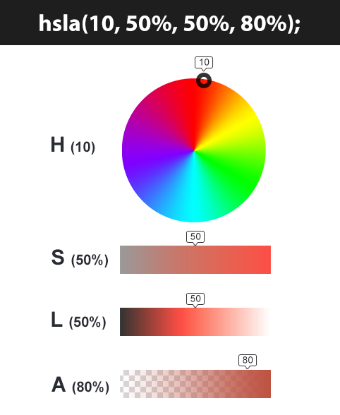
HSL colors

Text
Techniques That Offer a Wider Choice of Typefaces
- font-family
- font-face
- Service-based
- Font-Face
Type Scales
You may have noticed that programs such as Word, Photoshop and InDesign offer the same sizes of text. This is because they are set according to a scale or ratio that was developed by European typographers in the sixteenth century. It is considered that this scale for type is pleasing to the eye and it has therefore changed little in the last 400 years.
Attribute Selectors
You met the most popular CSS selectors on page 238. There are also a set of attribute selectors that allow you to create rules that apply to elements that have an attribute with a specific value.
JPEG vs PNG vs GIF — which image format to use and when?
WRITTEN BY: Rahul Nanwani
There are hundreds of image formats available each with a specific use case. I bet most of us wouldn’t have come across 90% of the image formats listed on Wikipedia. In this post, we would only be looking at the three most commonly used image formats in websites and mobile applications — JPEG, PNG and GIF. Several statistics reports, including the one from HTTP Archive, indicate that these 3 formats together comprise of more than 95% of all images loaded on websites. However, these 3 image formats have significant differences amongst themselves thus making each of them suitable for specific use cases. Understanding these major differences would help us deliver the best possible images to our website and mobile app users.
- JPEG images don’t support transparency and are hence not usable for such cases.
- PNG images support transparency in two ways — inserting an alpha channel that allows partial transparency or by declaring a single colour as transparent (index transparency). Partial transparency makes the edges blend smoothly into the background. PNG8 images (discussed in the “Colours” section below) can support only index transparency whereas PNG24 images can support alpha channel transparency.
- GIF images support transparency by declaring a single colour in the colour palette as transparent (index transparency). Because of absence of partial transparency, the edges (specially rounded or too-detailed edges) get a poor jagged effect. Though this can be solved to some extent using dithering, with improved PNG support, GIF is unsuitable for images with transparent backgrounds.